Posts

Final Portfolio

Image
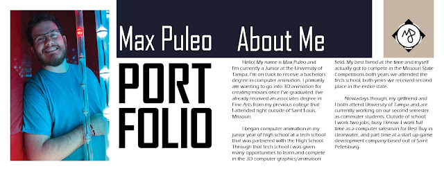
Final Portfolio Well this is it, this is my collection of work from the semester's worth of work! There's a lot of pieces inside here that I'm very proud of and there's a lot of these that will surely make it into my future portfolios. I had fun making this portfolio and it's definitely a nice layout that I stumbled across! It took me way longer than expected to reread and in most cases rewrite my artist statements for each piece. Overall, I'm happy with how this turned out. Thank you all for the fun semester!

Business Cards

Image
In this Project we were to create three business cards. We were supposed to use the logos we previously created. So initially I created some sketches using Adobe Illustrator. I spent more time on these sketches that I was expecting and they were much closer to finished products than my sketches normally were. With this I tried very hard to not find many other inspirations because I didn't want my business card to be plain and boring, so if I ever produce these and give them to clients. Anyways, I've narrowed the cards down to three that i'm happiest with and finalized them inside of Adobe InDesign. Concept One: First, I've chosen this one because I think the logo hanging off the side on the front of the card looks interesting. And the gray lines reaching around to back of the card leads the eyes to the back of the card where it has my Instagram and a couple of the things I'd consider myself good at. Concept Two: This concept was much more simple t

Gradient Mesh

Image
The photo above is my project based around the Gradient Mesh tool in adobe Illustrator, With this tool you can create a shapes and fill them with custom gradients. The objective here was to find a photo that you find interesting, or take a photo yourself of an item that you would like to recreate. I've chosen a photo I took a little over a year ago of a Pop figure I have. I chose this photo because of the simple color palette and the nice variety of light to dark colors. In the photo above, I have the original on the right and the recreation on left. Overall, I'm very proud with how the gradient mesh and how it turned out for me. I had a lot of fun with figuring out how to best use the tool. Initially I began with trying to make the entire picture from a single gradient but I quickly learned that it was far too advanced. So I took a different approach where I would create a shape such as the head and then create a gradient for just that single shape, this method worked muc

Personal Logo

Image
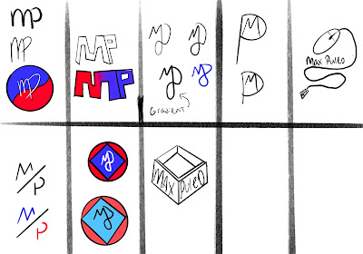
A couple months ago we were assigned to create a logo for ourselves, it was supposed to represent who we are and it's supposed to be a logo we'd be proud to slap on everything we produce for the remainder of our Graphic Design career. So after thinking of some ideas in my head of a logo that I would like, I got my iPad and got to work sketching some of those ideas out. I was having a rough time because there's not any one skill or activity I would relate myself to, which means I wasn't comfortable using a camera or something of that sort as a base for my logo. After sketching, I picked three logos that I believed were the strongest out of the bunch and crafted them in illustrator with a couple techniques. I was very fond of the first two but unhappy with the last one because I just didn't care for the mouse, and I didn't want to feel restricted to a computer mouse. Now that I had it narrowed down to two potential logo's that i'd be hap

Somewhere

Image
 Somewhere, in a galaxy a long time ago, we were tasked with placing ourselves into a scene of our choice. The main objective was to include a photo of yourself into a photo of a place that you've never been, or somewhere that you'd like to be. As you can see above, I've chosen a photo of the younglings training in the star wars universe. I chose this because I had a couple ideas of replacing Obi-Wan with myself, or turning myself small and green like Yoda because I thought those would be fun. However after some thinking, I came up with an idea to place myself in with the small crowd of younglings training. I thought this would be hilarious because a grown man undergoing the same training as children especially in a universe as crazy as star wars, sounds quite comedic. Here is the edited photo with myself included in the group of younglings. I had quite a bit of fun trying to figure out the best way of completing this. I had some trouble with a couple things

Pre-"Somewhere" Photoshop Post

Image
We were asked to go to some provided links and pick photos that fall into certain categories. This would be my selection for a photo that would be hard to photoshop yourself into. I've chosen this one because of the framing and the lighting in this shot. You can see that there's just not a ton of space to import a photo of myself that wont look out of place, and it would also be hard to match the overexposed light coming from the middle of the shot. This next one is a photo that is supposed to inspire us for the upcoming project where we have to photoshop ourselves into a photo. I've picked this one because this gentleman has not only added some comedy which i appreciate, he has also blended himself in rather impressively.  This is my photo I've chosen for it's humor. I've seen photos by James before and they never seem to disappoint. This isn't necessarily a "good" photoshop but it is sort of like a genie wish. It's exactly

Autoscopy

Image
The Autoscopy is meant to be a change in an environment or a visual hallucination. That's exactly what I attempted to show here. In this photo there's many things I had fun envisioning. As you can see there is a cliff that myself and a small robot are sitting on, enjoying the view. Overlooking a field, which gives off a serious acid trip feel. I had fun mashing together two separate environments that are hardly the same as the originals. Honestly, I couldn't exactly tell you where my train of thought went and why I chose the shapes and colors I did. But I am very happy with the glitchy circles floating in the middle connected by lines. If I were to do this again I believe that I would spend more time focusing on the light in my photo. It was hard to try and change where the light source came from on my body, but i'm still satisfied with the result.