Personal Logo
A couple months ago we were assigned to create a logo for ourselves, it was supposed to represent who we are and it's supposed to be a logo we'd be proud to slap on everything we produce for the remainder of our Graphic Design career.

So after thinking of some ideas in my head of a logo that I would like, I got my iPad and got to work sketching some of those ideas out. I was having a rough time because there's not any one skill or activity I would relate myself to, which means I wasn't comfortable using a camera or something of that sort as a base for my logo.
After sketching, I picked three logos that I believed were the strongest out of the bunch and crafted them in illustrator with a couple techniques. I was very fond of the first two but unhappy with the last one because I just didn't care for the mouse, and I didn't want to feel restricted to a computer mouse.
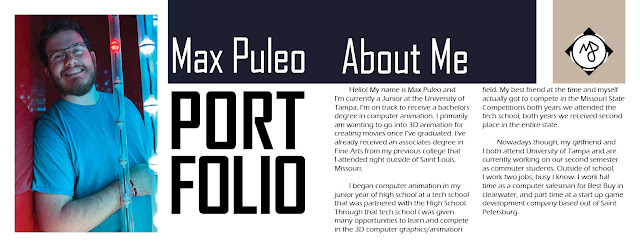
Now that I had it narrowed down to two potential logo's that i'd be happy with, I recreated them in Illustrator and added color to each to see if that would help my decision. Eventually I chose the logo I'm using today and that you might've seen in the past couple projects in this class. It would be the logo in the bottom center of the photo above, I chose this one because mixing the M and the P - for my initials, was pretty clever in a way I have not seen before.


Comments
Post a Comment