Black and White to Color
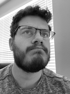
This is the photo I chose to use for the black and white reference.
Complimentary:
This is the first Black and White to Color Portrait that I did out of these three shown. However, this is not my first experience taking black and white photos and reviving them with colors. I had fun with this project because being restricted to the color palettes at color.adobe.com was quite interesting. I tried to change the palettes to something that I could potentially make look somewhat normal but I also tried to mix in some interesting tones like seen here. It was quite a challenge to use the three shades of green in different places because they can be quite close while painting onto the photo. In this image though I also had a bunch of trouble with the hair and trying to only have individual strands colored, but that was very time consuming and the edges are a little too hard.
Compound:
This was the next portrait that I did for this project. This one was much easier to myself because I had some practice on the first go around and knew what to look out for. Also this time I had colors that were much closer to skin tones and acceptable shades for the wall and shirt. With this portrait I used a larger soft brush to color in the hair so it would fade a bit more naturally. I'm much happier with attempt than the first one because it looks closer to real life.
Analogous:
This is most likely the hardest one that I attempted. It was difficult to get the colors to blend into convincing colors in the portrait. I was initially between a spread of Blues and Greens and I almost think in hindsight the green might have been easier. However, I do think that the Tag Brush is the most visible in this portrait.


Comments
Post a Comment